Opinions on my art? :D


Go to page: 1 Bookmark Thread
xXMidNightWolfXx

11:36pm Nov 22 2009

Normal User


Posts: 2
Okay, so... x.x;; er.. thats a bit bright. o.o;;
I'm new here. o: Mainly joined to meet some new friends. 
I thought I'd post some of my art and get some opinions! :D Tell me what you think? It's much appreciated. ^_^


-Newest one.
http://midnightwolf60.deviantart.com/art/Playful-Wolf-144025689

-Stitch!
http://midnightwolf60.deviantart.com/art/Stitch-139777937
Morgain

1:07pm Nov 23 2009

Normal User


Posts: 934

Well, I'm not the best artist around, but I browsed your DA, and I'm rather impressed with your color choice, which was always hard for me. It's hard to write a comment, since it's hard to see what your shooting for. For example, I learned to draw wolves by watching my old copy of Balto, so I choose a more cartoon style. I found it was easier to sow emotion that way. Lately, however, I've been practicing a more realistic approach. With nsrrower eyes and a little less curves, my style is more half way in between.

I really like your wolves, but it seems a little unsure of what your method is. On your "Snowy Wolf," which I particularly like, The body seems rather cartoon-y, as if he were made of blocks. The legs seem a little short to me, too. However, The texture in the fur and backdrop are quite awsome. (Sorry, I can't think of better words today.)

So here's a few tips I often reffer back to:
1. Wolves have a high head and low set eyes.
2. Wolves are alive with round muscels; don't be affraid to bump them up!
3. Is this a fluffy, skiddish, or sleek wolf? How can I portray that?
4. How do other artists portray this? What do I like about it? What can I do to make it my own?
5. What separates me from other artists?
6. How is this wolf unique? (sp?)
7. Try to make a wolf from nothing but geometric shapes. Fun isn't it?
8. Never doubt yourself, no matter what your art or style is.

Alright, I geuss those are kinda universal, but, yeah.... I realy hope that helps a little. (Sorry, I'm not exactly a mirical.) Keep updating! I'd like to see more of you!


Offline; back and looking to get roleplaying again (as well as reviving my poor pets!)
Saraluvspets

3:07pm Nov 25 2009

Normal User


Posts: 2,668

please do not think i am  being mean by doing this, but i think the wolf looks more like a collie than a wolf


What the Hello Kitty! Holy Shiitake Mushrooms! -Ah, the many gurbled words of Sara... -Oh, join this rp... http://www.rescreatu.com/forum/cat/games/rp/we-were-meant-to-be-but-i-just-can-039-t-do-it-/~page/1/
Nouveau

11:29pm Nov 25 2009

Normal User


Posts: 2,962

Your art is amazing.  *-*  I love your wolves, adn your anatomay is nothing short of epic.  Since I'm a fairly new artist, I suppose my opinion doesn't mean much, but I really like your style.

Tell me if you're opening up commissions soon, okay?  :3


Actively inactive. Formerly lolalover6.
Yoshi

5:20pm Nov 26 2009 (last edited on 5:28pm Nov 26 2009)

Normal User


Posts: 3,642

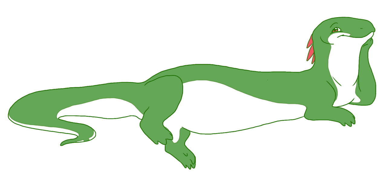
Most of this is based on the playful wolf. ;o So...

Your anatomy's fine in most places, but there are a few little wonky things about it. The tail and eye, for instance; the tail is too wide at its base, and the eye is positioned really, really weirdy. In fact, most of your animal eyes are too high, and tilted forward when they shouldn't be. Usually, the inner corner of the eye should be pointing just about directly toward the nose, when looking from a side view.

I'd say your toes could use some work too. The paw pads shouldn't be visible, since normally they'd be hidden by its fur, and the wolf is even standing in gra-ss, which should cover parts of the feet. They also look quite uneven, and shouldn't all get smaller the farther away they are. Toes aren't really on a big enough scale to warrant the use of perspective's whole 'distance = smaller' thing. It would be better to use the actual size differences in them, with the middle toe being biggest, the third toe being just barely smaller than it, the innermost toe being slightly smaller than that, and the outermost toe being smallest. Like you had on the hind left foot.

Your lines could definitely use some smoothing. Try using long, somewhat quick strokes, rather than short, repeated ones. Short strokes tend to look fuzzy and uncertain, but long ones, while they may require some cleaning up toward their ends where they'll get a bit more curly, stay mostly smooth.

And I'd suggest perhaps staying away from Photoshop brushes, like I notice you did with a lot of your backgrounds. Using a brush won't improve your skills as much as really learning to draw that thing will be, and doing things yourself usually looks better. Especially with clouds. Having a bunch of identical clouds looks really weirdy.

... My brain, all Earth Scienced up as it is, can hardly even fit around the fact that you have both cirrus and what seem to be altostratus clouds below a cumulus cloud. Or at least, I think it's cumulus. x3 Looks funny.


Ardor

8:11pm Dec 11 2009

Normal User


Posts: 46
Most crits on your art are things you'll get better on with time. I'd advise you to study shading more. Cell is the easiest form to do, soft shading is the hardest to do correctly. I would personally start off with cell shading and the evolve into soft, which many artists tend to do anyways. It teaches you contrast and how the light rolls off the contours of the body. If you remain with soft shading, don't be tempted to put fuzzy light strokes where it looks good, use atleast 3 and preferably 5 shades. :3 One highlight shade, a light shade, a middle color for the 'base' and two darker shades. Your art is already good, and I can tell it'll end up being really great soon. ;3
Epona

10:15pm Dec 11 2009

Normal User


Posts: 2,963

I think they look good...but I say that about my 7 year-old brothers drawings (And they ARE good). Anyway, you got a dA watch from me. (art-bandgeek)


Resident mounted archer
Go to page: 1