I would agree that the Draqua could use a revamp, although it's not because of the pose at all.
It's just.. little things with quality.
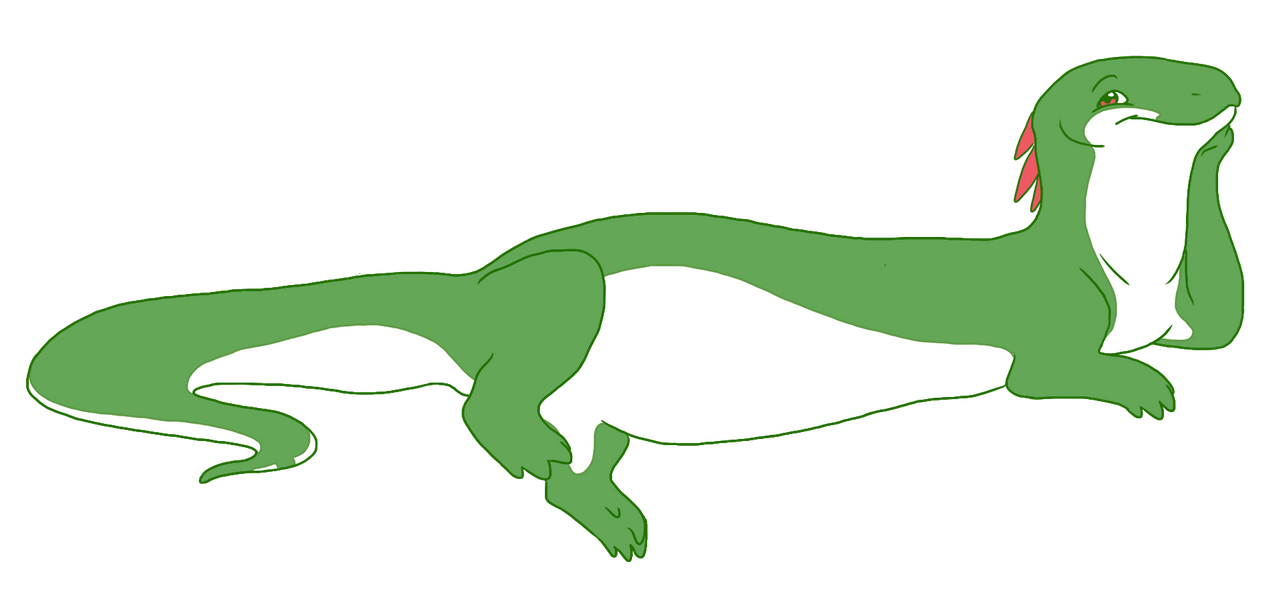
There are some uneven, sort of uncertain-looking lines here and there, especially on the tails. They're not too noticeable unless you're really looking, but they are there. The lines differ in heaviness between stages, too, so the teen and adult look almost faded.
And a bigger one - the shading, while being just as uncertain in places as the lines, no longer entirely fits with Res' style.
Look on the outline of almost any Creatu that isn't super, super old. It should have a thin band next to most of the lines where there is no shading - just the base color. The Malal's the most obvious example of this that I can think of.
On the other hand, all the Draqua's shading goes right up to its lines. This makes it look like it must be floating in space, with nothing around that reflects light at all. Gives it an odd, basic sort of look. The look you get when a person's pretty sure about shading, but they haven't actually done shading studies in order to learn reflections and backlights.
Basically, it looks unprofessional.
Also, the albino Draqua has a similar problem as the albino Sirleon had - it's extremely washed out, which makes it look extremely old as well. It's so bad in the Draqua's case that I find it literally painful to look at. Granted, my eyes are pretty oversensitive on brightness, but still.
 Normal User

 Normal User

 Normal User
 Normal User
 Normal User