Revise the tesuri revamp


Go to page: 1 Bookmark Thread
Ping

4:52am Aug 1 2010 (last edited on 4:57am Aug 1 2010)

Normal User


Posts: 1,775

I am sorry to say, but the tesuri revamp is a touch below 'recreatu art' standards in my opinion. So I would like to suggest a revision of the art. I am not asking for it to re-drawn completely, but just to correct a few areas of it. I did believe that there were a few parts of this revamp that need correcting and that the artist started rendering prematurely (therefore did not adjust a few mistakes).


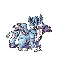
 The first stage has quite a few things that I believe can be corrected. First of all, the left eye is larger than the right. The right wing also looks like it is connected to it's spinal cord. I also believe that there is not enough shade on it, the wings have barely any shades on it at all.


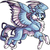
 The second stage's right wing looks a tad awkward and it is also missing a right leg (it should be visible, either that or it has hind legs jointed like a lizard's).


The wing on the third stage is strange looking and lacks detail in shading. I think it's hind legs need some correcting and the head looks awkward.

Again, I am not asking for it to be redrawn nor am I asking for the older one to be returned (I actually wanted a revamp for a really long time xD). So if any of the res artists have the time and would like to alter it, please do ;D

I have nothing against KiraraNeko; she is not a bad artist and I do not want to see anyone blaming anything on her. If you do, you're sleeping with the fishes D<


I (HATE)' YOU

Feel the love man D:<

Life

6:08am Aug 1 2010

Normal User


Posts: 1,015

I think on the middle stage, it's the left wing that looks kinda awkward, not the right. :) The left wing is missing the blue fur that the left wing has. :D And for the adult, which parts need more shading? o_O and lastly, i don't really like the baby stage at all so, :D

Other than all that, I guess your suggestion is great. ;)

SethAngel

10:37am Aug 1 2010

Normal User


Posts: 61
Someone did a simmilar suggestion, although they were just asking for it to be de-vamped all together. I think that minor changes 'would' be a good idea, and it's all matter of opnion. Pat said as long as users are happy then he won't change it. I for one am happy with it xD But you ARE right minor changes could be made to make it better. Will they? I highly doubt it, if they didn't do it for the iluvu they probably won't do it for the tesuri~ but I support


John 3:16
rainbow12

11:41am Aug 1 2010

Normal User


Posts: 1,713

I love the new revamp, the old one used to be scary and ugly

your corrections are pretty good! on stage 2 I agree with love that it is the left wing that should be changed! 

username

11:58am Aug 1 2010

Normal User


Posts: 616
to me, the new revamp looks too angelic. i mean i've never really liked the tesuri, but it just seems a little odd to me. the heads on both the 1st and 3rd stage don't look right. it seems like the 1st stage is for lack of a better word flat and too feline. the 3rd stage looks kinda deformed. i mean the fir on its cheek doesn't need to be visible on the left side.
xeeroh

2:44pm Aug 1 2010

In Training


Posts: 355
You could make a post like this and point out flaws in every set of creatu graphics, but that doesn't mean they need to be revised.

Artist here are not paid for perfection and timeliness is a factor in production.

It would be a waste of resources to go back and edit released work for very minor flaws when the overall graphic is perfectly up to style standards.


SaruSaru

11:25pm Aug 1 2010

Normal User


Posts: 373

 Bang. She said it all.

I agree 100% with Xeeroh on this one, guys. :/


Sven

12:28am Aug 2 2010

Normal User


Posts: 21
I support the idea, the Tesuri's used to be more of a wolf creatu, now it's more on the bird side.


"Rather be dead than cool." - Kurt Cobain
chance437

1:11am Aug 2 2010

Normal User


Posts: 15,067
Xeeroh, yes, but, Patrick has said that a Creatu stays as long as the Users like it. Now, if Users don't like it, then a simple revision wouldn't hurt.


Life

6:26am Aug 2 2010

Normal User


Posts: 1,015
i agree with Chance in that way. I simple revision of it wouldn't hurt too much. And in what way was the old tesuri scary? And rainbow, call me Cas, not love. XD
Lilith

8:43pm Aug 2 2010

Moderator


Posts: 2,153

I wish Kitty would have left her blog up. It showed pictures of the Tesuri from the first to the most recent, and when you look at them all together, there is not a whole lot of difference in the second version as opposed to this one, and it certainly looks better than the first. It seems to me that the opposition is to change itself, not the actual creatu. Pretty obvious after viewing all three versions together.

"Xeeroh, yes, but, Patrick has said that a Creatu stays as long as the Users like it. Now, if Users don't like it, then a simple revision wouldn't hurt."

I like it, as do hundreds of other users.


**•̩̩͙✩•̩̩͙*˚♫ and the haters gonna hate hate hate hate hate ♫**•̩̩͙✩•̩̩͙*˚
Sven

11:33pm Aug 2 2010

Normal User


Posts: 21
Yah, but they changed the Tesuri in the ways that it's not even a wolf creatu anymore. That's the main reason it bugged me.


"Rather be dead than cool." - Kurt Cobain
Sven

11:35pm Aug 2 2010

Normal User


Posts: 21
And just the simple things would make it look so much better. Like the last stage looks so awkward like Ping already said.


"Rather be dead than cool." - Kurt Cobain
Yoshi

7:37am Aug 3 2010

Normal User


Posts: 3,642

Ah. I try not to look at the bad things - I actually love the new design itself - but I do think this one could use at least a touch-up here and there with its anatomy. In the past it was obvious people were protesting just because the revamps meant change.. but with this one, there is actual reason for people to say something's wrong. Especially with that adult's insanely awkward hind legs. Most of the other issues are pretty subtle, but that one's like. Whut. o_o

And I think that was the point, Sven. xD Before it was just a wolf with wings - now it's our wolf with wings.


xeeroh

1:26pm Aug 3 2010

In Training


Posts: 355
I don't see the anatomy flaws people are talking about. I am sure some are there, I just don't see any that bother me. Animals can position their limbs in some strange ways, pair that with different viewing angles, and well, you never know what you'll get.

Besides, this has no more anatomical flaws than say, the Omni. But you all still like that one.

Even if things are slightly off, it's still not worth having the artist back-track for minor flaws, when they could be moving on to new projects (like new creatu). Furthermore, this is a free to play game that doesn't have major funding or pull that great of a profit (yet). You just can't expect perfection, if for no other reason than the artist could not be fairly compensated for the time that would take.

Now if users want to to foot the bill for 'touch-ups' maybe we can talk. (j/k)

Also, it is okay to make posts like this pointing out errors in creatu graphics. It is good for the artist to read so they can do better next time. But don't expect changes to be made to the graphic set (unless it is like, the first release of Malal)!


chance437

4:33pm Aug 3 2010

Normal User


Posts: 15,067
The Omni has flaws?


rainbow12

6:14am Aug 4 2010

Normal User


Posts: 1,713

yeah! if you look closely the Omni has flaws

also I bet KiaraNeko is feeling a little bad right now! She just did an AMAZING revamp and now everyone is sayin it should be changed back! would you feel happy if someone was critizing you art? NO! you might feel hurt, unappreciatted!

In fact I would like to see all of you do better KiaraNeko! go head and try to make graphic art as great as she can! If you think it should be changed then show Patrick how to change it! Change it yourself! But making someone feel bad is not the way to go

at least I would feel bad if this was done about my art! 


Ping

7:45am Aug 4 2010

Normal User


Posts: 1,775

I'm sorry to say but I don't think it's up to scratch. It's quite below what I set my expectations of the standard of art is here and I do think it deserves a revision. I do feel that there is a point in revising it and I'm not expecting it to be done immediately.

I have noticed several flaws in other creatu graphics. However, this was really the only one that bothered me. Now,I know people are going to kill me when I say this. But I don't think it's slightly off. But it's a little bit on the very off side. I don't think I'm going on a mad rage like the another person who requested a revision of the malal due to minor details. But I think it does look a tad dodgey. Really sorry guys ;(


I (HATE)' YOU

Feel the love man D:<

chance437

10:53pm Aug 4 2010

Normal User


Posts: 15,067
rainbow, art is for criticizing. We aren't saying that it stinks, we are just asking for a few minor changes. We aren't asking for it to get changed back. We like it, it's just a little.. Off.


Ping

8:36pm Aug 5 2010

Normal User


Posts: 1,775

'would you feel happy if someone was critizing you art? NO! you might feel hurt, unappreciatted!

In fact I would like to see all of you do better KiaraNeko! go head and try to make graphic art as great as she can! If you think it should be changed then show Patrick how to change it! Change it yourself! But making someone feel bad is not the way to go

at least I would feel bad if this was done about my art!'


Rainbow, have you ever had your art criticized? If you did and you felt the way you described one should feel, then you're not taking it well. Really, critique is actually what every artist wants to hear because that's how to improve. I might change it myself once I get back home (on saturday).


I (HATE)' YOU

Feel the love man D:<

Go to page: 1