pointless charcoal? critique please c:


Go to page: 1 Bookmark Thread
Bucky

9:12pm Feb 12 2014 (last edited on 9:12pm Feb 12 2014)

Normal User


Posts: 2,021
OK so this is like my 3rd/4th piece in charcoal and I'm pretty happy with the way it turned out, but I'm still not completely comfortable in the medium since I kind of just... figured it out and never learned the finer points to using charcoal.

I also found that this was a really pointless thing to draw because it's basically just copied from a photo of Mark Twain I found. my art teacher wanted me to do it because she needed a portrait of an old man holding a sextant (device that measures the distance between stars) for the school's play. but I mean she really could have just edited the reference photo on the computer and printed it out and I just don't really know how I feel about this because it makes me feel like a less-efficient, crappy photocopier. Though it was a good exercise, that's all it was and I don't know how I feel about that.


Thoughts?
Suggestions?
Advice/Critique? 
All is appreciated!


<---HA by shino || Buck by Zen--->
zoeshadowtamer

1:18pm Feb 14 2014

Normal User


Posts: 39
Wow! This is awesome!

That was a good exercise, and I think it's great to get practice in whenever you can! I apologize for not being able to give a (more thorough) critique, since I never use charcoal, but this looks great! Nice shading and highlights! Everything looks very smooth!


Yoshi

1:39am Feb 24 2014 (last edited on 1:50am Feb 24 2014)

Normal User


Posts: 3,642
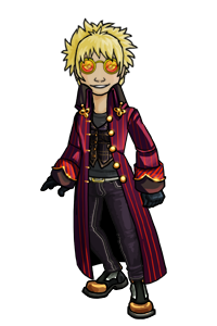
i really like the way his hair looks, very soft and yet well-detailed toward the front to frame his face. the lighting here is really nice. strong shadow level differences and texture to draw the eye. most of what's on his head/face looks great

i'd suggest trying to put more contrast in the eye tho, it seems a little dull compared to the area around it. the suit also seems.... smudgy i guess? it's got lots of medium grays and everything blends together. it makes an obvious and kind of jarring difference between the face and everything else. o:

of course lower light and less detail works for the unimportant areas farther away from the light source, but erasing some stronger highlights into the front of his collar, hand/arm, and the sextant could help it feel more unified. you might also darken those grays a bit toward the bottom right, to take some focus off of that area

basically, the face, arm, and sextant are important. put the most contrast and detail into those areas! or i guess rather, put contrast and detail into the second two so they're more consistent with the face c:


AlexMassecre

7:05pm Mar 1 2014

Normal User


Posts: 272
you're a lot better with charcoal than i am and people at that. would like to see more.


uxpXJLx
Go to page: 1