please rate my art


Go to page: 1 Bookmark Thread
Embrynn

9:57am May 30 2010

Normal User


Posts: 959

im new to rescreatu and i noticed there a quite a few very, very talented artists on here. Because of this, i hope to gain some tips on my own art, to improve myself :)

please comment as you see fit, for now i have nly done two pictures, one for a contest, the other for my profile

My fursona:

tle="Click for a larger view" width="333" height="540" />

the contest picture, LeTainted's Vortex:

tle="Click for a larger view" width="668" height="766" />

please comment :)


Embrynn is : Offline :(
Image and video hosting by TinyPic
Staryulynn

10:03am May 30 2010

Normal User


Posts: 572
Oh I really like. ^o^


-and a new day will dawn, for those who stand long, and the forest will echo with laughter-
Embrynn

10:22am May 30 2010

Normal User


Posts: 959
thank you :)


Embrynn is : Offline :(
Image and video hosting by TinyPic
rainbow12

6:26pm May 31 2010

Normal User


Posts: 1,713

out of 10:

9.99 out of 10! that is like 99.99% out of 100

OH I LOVE the vortex

i rate that 1 million out of 10! it ROCKS OMG LOL <3 D5 

Embrynn

10:56am Jun 1 2010

Normal User


Posts: 959
thank youz :DD


Embrynn is : Offline :(
Image and video hosting by TinyPic
Ping

8:11pm Jun 1 2010 (last edited on 8:13pm Jun 1 2010)

Normal User


Posts: 1,775

I can't possibly rate anything. I don't think I can come up with a number to represent the quality any piece of art xD

However, I did spot some major anatomical problems with your red thing. So I redlined it (in green xD)

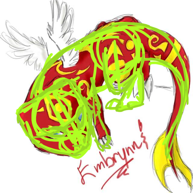
First of all, the back's kinda lumpy, so yeah; make sure it looks smooth (not all the time, some poses require the back to be lumpy, but not this one xD).

Second of all, the butt hangs out way after the legs have finished. The tail also doesn't really connect with the body much (I like to think the tail is an 'extension' of the spinal cord). And there are these really pointy things jutting out of the butt, reminds me of a cattle ;D


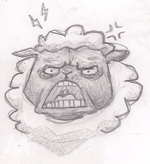
Another thing I spotted was the head. The head's a sort of irregular 'rhombus' shape. A head's general shape should be symmetical


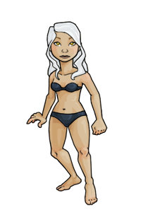
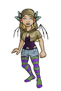
The thing I'm bugged with in the second picture was that the lineart was a brighter colour than the colours. I don't like seeing that, looks cheap in my opinion (purely my opinion, maybe someone could pull off a light-lineart-non-cheap-looking pic? I dunno).

With both of them, I found that the highlights weren't sharp enough. It also looks like you used the dodge tool; a load of people use that tool but I wouldn't say I'm a fan of it. I mean it's an excellent tool, but I just prefer picking a shade myself and brushing it on D8

Also one singular enormous, big mistake you've made. You've saved them in JPEG! JPEG is only for photographs, and it looks like you've tweaked to quality a tad too much. Save as PNG next time 'kay?


I (HATE)' YOU

Feel the love man D:<

Embrynn

12:10pm Jun 2 2010

Normal User


Posts: 959

thankn you so much ping, these are great tips :) i also never realized the whole thing about the jpg and png issue, i just saved it in jpg because i knew it would always work when i uploaded it to something

thanks again though, ill keep this stuff in mind :D


Embrynn is : Offline :(
Image and video hosting by TinyPic
Yoshi

8:42pm Jun 2 2010 (last edited on 8:44pm Jun 2 2010)

Normal User


Posts: 3,642

Yah. I've definitely heard that you shouldn't use the dodge and burn tools - they make things look lifeless. Shadows usually aren't actually black, and highlights usually aren't actually white, so using tools that simply add black or white into your base color doesn't really work. It looks weird and unnatural.

If you wanna make your coloring jobs look more lively, try picking the colors yourself - and pick something with the type of light in mind. ;o If you have warm light, you'll want to add warm colors into your base for highlights, and then cool colors for your shadows. Opposite goes for cool light.

Soo, yah. All that glorious color theory stuff. xD

Also, I'd recommend cleaning up some of those lines, unless you're using a sketchy look on purpose. It makes 'em look like they're not quite finished.


Embrynn

10:44am Jun 3 2010

Normal User


Posts: 959
thank you yoshi :D these are the kinds of tips im looking for


Embrynn is : Offline :(
Image and video hosting by TinyPic
Go to page: 1