Kirsti's Daily Sketchbook =D


Go to page: 1 ... 5, 6, 7, 8 Bookmark Thread
Neiru

10:38pm Mar 1 2010

Normal User


Posts: 225
I agree with Uwi, the brown makes it neutral. :) And it also gives the character a sort of eccentric look. Can't wait to see the background. :D


*Same art as my DA ID. Check out my rancher shop. <3
Theyellowflash

6:04am Mar 2 2010 (last edited on 6:05am Mar 2 2010)

Normal User


Posts: 1,210


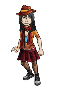
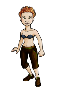
i dunno,but for some odd reason,to me at least, it seems like it would look better if you'd make it so that the red matches the browns a bit more,y'know,down on the saturation a bit or vice-versa
 
 again,thats just me,and since uwi and neiru make the majority... xD
 
 maybe you could just make an overlay thingie that liek,makes the red a bit less saturated at the bottom and gradually makes it more vivid to the top. kinda like you did with the shading on the gun with the black going from the tip and then fading into the base color and all.....
 
i dunno,im bad at explaining :c
 
and is that candy thing a tattoo or supposed to be real?xD
 
Kirsti

2:03pm Mar 4 2010

Normal User


Posts: 542

Thanks, guys! I tried making the red a little less bright. Do you reckon it's any better?

LOL and the candy is meant to be real XD. Does it look too flat?


EDIT: tinypic is being lame. Will add it to this post when it stops.


Also... Allen Walker! I really like the thumbnail >w< But when you click it you realise that's it's actually really messy and not as cool as the thumb makes it look OTL. *posts thumbnail*

full size


Go to page: 1 ... 5, 6, 7, 8