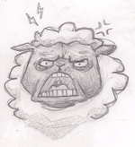
From what I can see from your drawings is that you don't exactly plan out your drawings and the first lines you place on the page seem to be your final lines.
You should really plan your poses first, from what I see, that's not what you're doing. Here's a nice tutorial for that: {CLICK}. You shouldn't really be winging it like this 'til you're real experienced. Take some time to learn some basic anatomy as well.
I redlined (in blue xD) your first two drawings. I didn't do anything to the legs 'cause I've no idea what kind of legs you were trying to draw (sorry!). Was it human legs or animal legs...? xD
Anyways, here they are:
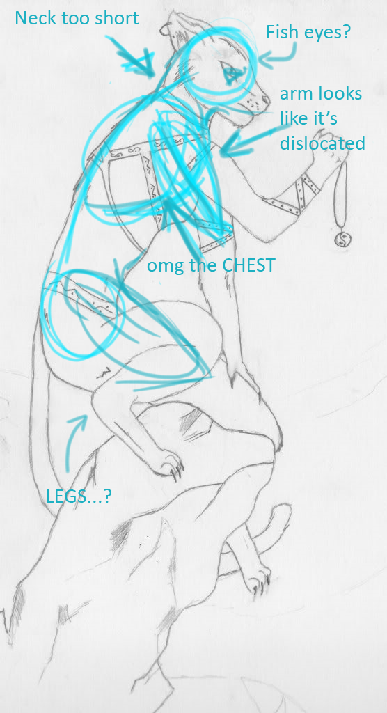
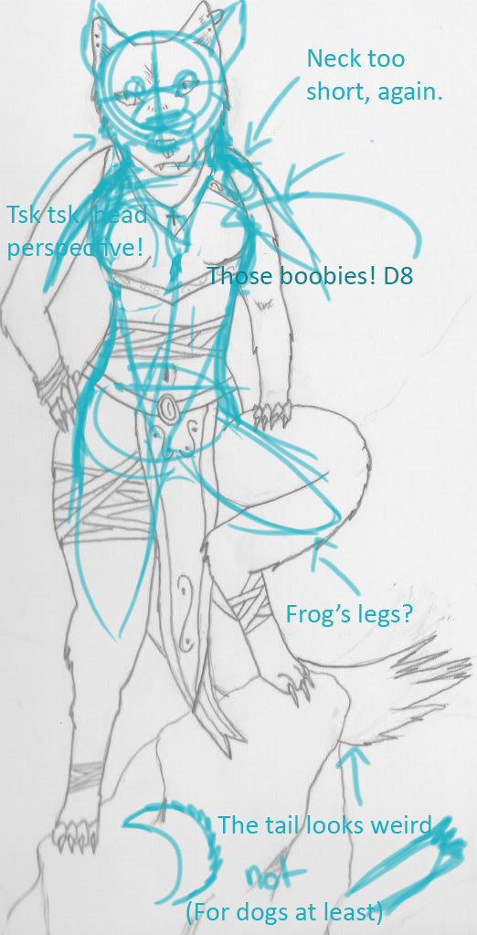
I didn't try correcting the boobs 'cause I'm hopeless at it. Boobs are really hard to draw... D:
About them new ones... Are you using layers?
Imma show you a basic way to organise your layers using one of your drawings. I did a quick render of it just to demonstrate:
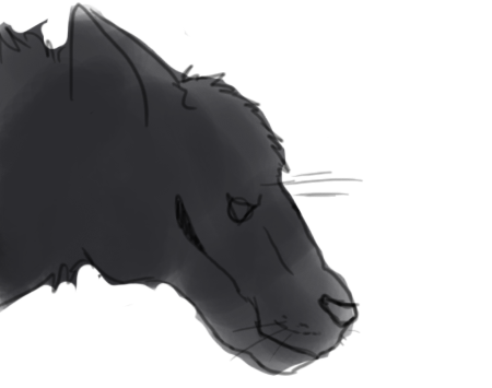
Here's your drawing, I kept it on the bottom la
yer to make a sketch and use it for reference.

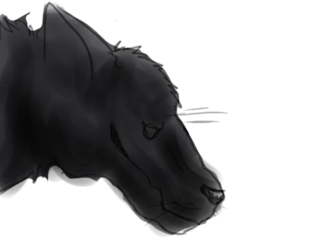
I then made a new la
yer and drew some lineart (you may use the pen tool for this). I kinda re-drew it in my style too 'cause I'm lame and can't lineart other people's things without Pingifying them Dx
I then made a la
yer underneath the lineart la
yer and blocked it in.
I then made a new la
yer on top of the of the base colour and set it on multiply, I then did the shading. Make sure you remember where your light-source is at all times!
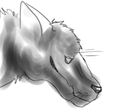
This is how it looks like without the base colour underneath it. The multiply property makes a la
yer make anything underneath it darker.
I put a new la
yer on top of the shading la
yer and set it on 'soft light'. I then did the highlights.
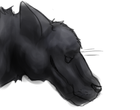
After all that's done, I made a la
yer underneath the shading, highlights and lineart la
yer and added the extra details (I forgot about the earrings, sorry D:).
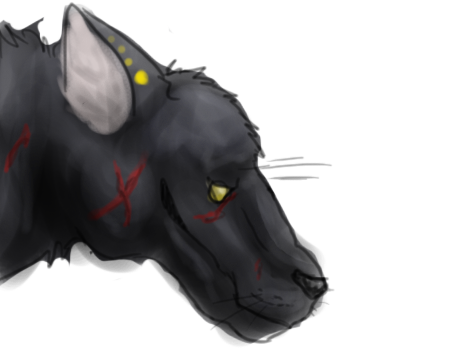
DONE!
Here's a screenie of the layers, just to help:
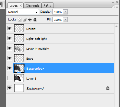
(la
yer 4's supposed to be shading, sorry!)
This render looks kinda ick 'cause I whipped it up in 10 minutes xD
I personally don't use this style of rendering, I normally just paint everything on one la
yer. However, this is a very good method to use when you're starting.
 Normal User


 Normal User
 Normal User