Hi, Req. :3 I'm no graphic artist, but I've picked up a few things from my friends that you might find helpful.
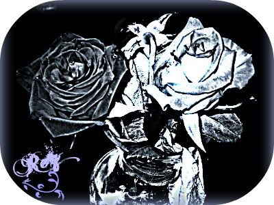
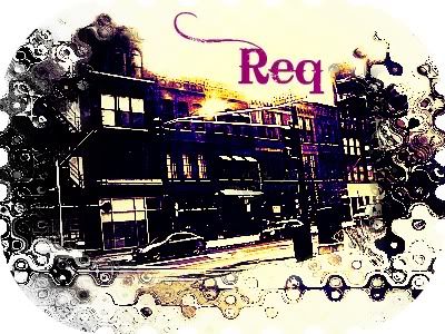
Both your banners have very high contrast and are very sharp; it's painful to the eyes. The second banner especially looks oversharpened or the threshold tool was abused. It would have looked better as normal photo with some blending layers. The text should have been incorporated into the actual banner rather than floating in a white space and the font doesn't match. Also, the border doesn't harmonize with the rest of the banner.
The first banner looks better, in my opinion. However, the text is unreadable and should be more distinct. The text could also be white to blend in with your colour scheme. The border could use some working on, as well. It glows and is blurry, while your subject is sharp.
I suggest applying the rule of thirds to your banner making and experimenting with different blending layers and brushes. You might also want to use a coordinated palette. For example, in your first banner, the colour scheme is mostly black and white - neutral colours. However, in the corner, you have a splash of lilac thrown in that doesn't appear anywhere else on the banner. Such colours don't really add anything to the final product.
However, I do like the colours you used in the second banner. I think you're off to a great start so far - keep it up. :3 I'm no professional and I very rarely create graphics, though, so this cirtique is purely my opinion and doesn't have to be considered if it's your choice.
 Normal User
 Normal User


