Arcele's Art & Critiques


Go to page: 1 Bookmark Thread
Nostalgia

8:39pm Feb 27 2010 (last edited on 9:13pm Feb 27 2010)

Normal User


Posts: 19
I really, really want to perfect my items and pet artwork before I apply, here or on another site through Virtual Pet List. I really like the community here, so I'm asking for critiques from you guys first.


If you happen to view this topic, I'd really like a comment, a critique, or another pet or item suggestion.


Some styles I'm shooting for: Xeeroh's style, Nekodragon. General Rescreatu item style.


Thank you and hope you like what you see! All art below are (c) to me, and they belong to no site =)


Items:


Pets:


wolfspirit25

8:48pm Feb 27 2010

Normal User


Posts: 1,441

I'm not an artist but there's a few things that bug me about your pictures so I'll give a couple very generic crits and leave the real critiquing to the pros.

On your handbag (or whatever you wanna call it), the top flap that you open to get stuff out of it seems lopsided. The lowest part should be where the clasp connects, but it seems that the semicircle ends slightly to the left of that. Also, the flap looks a bit more like an egg than a semicircle (if you look closely you can see that the right side is longer than the left side. I understand you were trying to go for a slightly sideways perspective (or at least that's what it looks like) but I think you overdid it a little bit, the amount of angle you have wouldn't have that big an effect on the shape of the flap.

For the wand/rod thingy, the handle is very bumpy. It has lumps and bends in an awkward way. It also gets thicker and thinner along its length. Work on making your lines straighter when drawing things like that. Also, maybe it's just my computer, but there seems to be very little shading on the handle. Remember, there's gradients of black too, the shadowy side will look darker than the lit side. Where it connects to the yellow thingy it looks almost like it's a little off-center, try to make the two pieces closer in diameter so it doesn't look like a piece of the yellow thing is hanging away from the black handle. It might be a bit structurally unsound and be more likely to scratch the holder :p

That's basically all I trust myself saying as, as I have said before, I am not an artist. Good luck with all your future efforts.


Nostalgia

9:12pm Feb 27 2010 (last edited on 9:14pm Feb 27 2010)

Normal User


Posts: 19
Thanks wolfspirit! I honestly didn't catch the bag errors. I agree the handle isn't straight. I think I'll revert back to using the pen tool for straight sections; freehanded it and didn't look too good. Something must have happened to the wand's resolution, because the dark shouldn't have been THAT dark. xD I'll edit those when I get the chance.


Thanks a bunch c:


I added another example.


Yoshi

9:15pm Feb 27 2010 (last edited on 9:15pm Feb 27 2010)

Normal User


Posts: 3,642

 Whoops. Bit of a late post. x3

Biggest thing I see that bothers me, other than the lumpiness that Wolfspi has already pointed out, is the shading. Your shadows are far too dark, you've no highlights, and you used so many layers of shadow that it looks soft-shaded.

Unless your light is very, very bright, you'll never have such dark shadows. You should keep your shadows closer to the original color; use two or three layers, and don't use so much black. Use a la
yer of lighter color as well, so that it really looks like there's light shining on the thing. And spread your different shades out more, so that they don't appear to run together. It doesn't look as good, having all the transitions right next to each other, then having a big chunk of black.

It also probably wouldn't hurt to study some color theory, and how shading works. Your shadows don't really look like they follow the items' forms.

Good luck on your goals there. ;o


Ping

11:54pm Feb 27 2010 (last edited on 12:07am Feb 28 2010)

Normal User


Posts: 1,775

Okies. I've only done a few item graphics in my life and I recieved a bit of training from Xee on how to do them as well. So here's what I've got to say

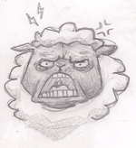
Your lines, they're generally all the same weight.It just looks a bit skinny and unprofessional in my opinion. I'm guessing you use the pen-tool (or some variation of it) amirite? Well, in my opinion (and it's only my opinion), the pen tool should be left to bigger things that will make the viewer's attention mainly focus on your colours and other details, not the lines. If you own a tablet, use the brush tool to create the lineart. It's kinda hard and takes a tad bit more time, but it's worth it.

Your shading's a bit dodgey. You've sort of got a fixed light source there, but it seems that you haven't really gotten to understand how light works yet. This can only improve with practice in my opinion. You're using too many shade layers. Two's enough in my opinion. Remember, leave your shading and base colour on separate layers. The shading la
yer should be on multiply so you can edit the brightness if it's too dark/ligth (hint: ctrl+U).

Highlights are important, use them

The actual drawing's a bit dodgey, your perspective's sort of weird and I think learning other drawing techniques (Crating, point-perspective) could help get it all right. But even so, nothing beats studying refs and practice. I also don't you should just focus doing item graphics only, you should always do larger things. It helps a bundle.

Oh and you should look at other people's item graphics, always helps when you're not sure what to do.


I (HATE)' YOU

Feel the love man D:<

Nostalgia

6:07pm Feb 28 2010

Normal User


Posts: 19
I usually use the brush tool, set at 3px; then I resize the image to 90px.


Is the shading what you meant? And maybe the lineart? Still working on improvement though. C:
Yoshi

6:38pm Feb 28 2010

Normal User


Posts: 3,642

I think I liked the more.. modest one better. I must sound negative for saying so, but this one's too bright. xD It looks like you tried doing highlights, but had them take up too much of the image. Like I said before, try to pan your layers of shadow out; make it so that the darkest and the lightest parts don't have much coverage. The recently released tank tops would probably be good for looking at this, as you can easily see each different shade in them, and their shading clearly behaves in exactly such a way.

A problem with both rabbits, though, is that they don't have definite light sources. On the head the light looks like it's coming from above, slightly to the right; on the body it looks like it's coming from below and to the right; and on the ears it looks like it's coming from above and to the left. It really causes the eye confusion.

And the tail added onto the second one looks strange.. It's like it's in front of the body, rather than behind, so that it appears to be stuck partly on the side. You should put the outline of the body in front, rather than that of the tail.


Nostalgia

12:06am Mar 4 2010

Normal User


Posts: 19
So'kayy; I don't mind if you're critique's too harsh or anything- as long as it helps me improve, I don't mind. I'll go inspect some items, thanks for the idea Yoshirules. :)


Light source. I'll do something to the bunny then. xD And the tail, too. I might take a shot at some Res-related items, as there's artist positions available. Why not take a shot at it? c:
Ping

1:58am Mar 4 2010 (last edited on 2:06am Mar 4 2010)

Normal User


Posts: 1,775

Here's how I set my layers when I do items. I've included the la
yer properties

(top la
yer)

Lineart (multiply, draw in a sort of really dark gray). Use asize 5 brush, and use the eraser to adjust the weighting of the lines.

Light la
yer 2 (soft light) The brightest highlights go here. The colour you use should be the same colour as the light la
yer 1

Light la
yer 1 (soft light)

Shading la
yer 2 (multiply) The darkest shades go here

Shading la
yer 1 (multiply) 

Base colour (normal)

Sketch (hidden)

(bottom layers)

When making items, work on a canvas that's twice the size as you item is going to be; after you're done, just resize the canvas. Also when you're done, you could adjust the brightness/darkness of the shading and highlights by hitting ctrl+U and adjusting the brightness. 

I find it helps to draw a lamp on the page to remind myself where the light's coming from. I tend to stroke my pencil above the paper in the motion of imaginary projection lines to work bits out. I don't really know how to tell you how to use the lamp 'cause it's really hard to explain D:

Even so, it's not just your rendering technique that makes these items look strange; it's mainly your lineart. You really need to improve your drawing skills rather than focus on how you render things.


I (HATE)' YOU

Feel the love man D:<

Go to page: 1