OAK Creatu Feedback Help


Go to page: 1 Bookmark Thread
crowflux

11:10pm Oct 2 2021 (last edited on 11:12pm Oct 2 2021)

Administrator


Posts: 329
Heya folks!! I wanted to make this thread so anyone can get some feedback for their OAK Creatu outside of the official site queue. 

Feel free to post your WIPs, and I will do my best to give you my critique so that you can be better prepared for the art approval process. ❤️

Please be aware that I am super duper busy as of late. Not only helming the new OAK process, but also working on new art content as Art Head for Rescreatu on top of being a freelance artist wanting to start their own business. Therefore I will likely be only checking this thread once or twice a week to give feedback.

Other artists (whether you are a site artist or not) are absolutely welcome to post their opinions and help others! Just keep in mind that what others suggest may be different from what I recommend. 

The tle="" target="_blank">Rescreatu Art Style is quite different than other pet sites, so please be forgiving and patient with yourself if you don't get it down right away! It really does take practice!! Some of us have been doing this for a very long time. So please don't be intimidated, as everyone has to start somewhere! You are welcome with open arms. 

This is a safe place for people of any skill to improve their Creatu art with positive, constructive feedback.

Let the art fun (& chaos) commence!! >:3c


Loki

5:40pm Oct 4 2021 (last edited on 5:40pm Oct 4 2021)

Normal User


Posts: 396
Hey Crow! 

I got this a few years ago from Kirara and I was wondering if it would be suitable for an OAK off the bat?

I am working on getting permissions to remove the watermark.

https://sta.sh/01oyqqejrsv3


crowflux

6:21pm Oct 4 2021

Administrator


Posts: 329
Hey Loki! I remember this piece. So cute!!

Yes, this would be acceptable as an OAK off the bat :3


Loki

6:22pm Oct 4 2021

Normal User


Posts: 396
Excellent! I'll get onto that CP in a bit then :D


KiRAWRa

7:47pm Oct 7 2021

Artist


Posts: 240
subscrobbled


Always looking to buy these Chimbies:
Albino | Achro | Glitch name/color | Prehistoric | Chimby Morphing Potions | Chimbies w/interesting names | CHIMBIES
omnoms

6:54am Oct 15 2021 (last edited on 6:59am Oct 15 2021)

Normal User


Posts: 1,938
these two are getting kinda old by now (esp the gold/silver one) and i'd already have some things in mind i'd change, but would love to hear a more professional opinion on them!

final 400 by omenaapplelarge by omenaapple
personally, comparing to res art, some troublesome elements would be
- the shading is too soft edged, its not very clean cell-shade edge
- ^same with the bottom one's lineart, the upper one has more crisp tho
- actual depth?? or posing?? instead of just putting limbs and features where they "feel about right", for example the uldavian one has bits and pieces missing on the tail just to fit the feelers on the square space lol. is there a way to work around that or do you just need to knead the pose so many times it actually works/makes sense 😂

(also, sub!!)


edit// throwing in this one too for good measure. the shading im happy with, but can res item art have blacked-out "silhouette" parts,or should all have lines and inner colour?


crowflux

3:38pm Oct 15 2021 (last edited on 3:40pm Oct 15 2021)

Administrator


Posts: 329
Heya Omee!!

Not that you don't already know this, but I have to start by saying I adore your art and these are still so stunning to me! <3

In terms of being stronger for Res Style, I'd have to agree with all the things you already pointed out. Lineart and shading should be v crisp and cell shaded. This means no flow or opacity should be used.

I think your posing for these are quite nice!! The silhouettes are strong and you are using up the square canvas space well without filling it up too much and making the art itself look square & confined. 
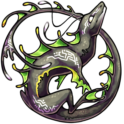
With your ex of the feelers missing on the tail: I think that's actually perfectly fine to do in order to make the piece feel stronger and less cluttered. On the flipside, feelers placed in those missing spots could still work out if you are careful not to break the silhouette and also use depth to control the eye's focus on the face.

Speaking of depth, I think that is probably the one area you could focus on to make your work even stronger. Not that it's bad at all, but it could be exaggerated more to help these smol graphics. 

For example, I'd suggest that the Uldavian Ahea's tail goes more into shadow as it goes back behind the head all the way up to just before where the tail starts to come to the front again. A tip to help with this as well is to be selective with using any highlights in those areas. 

We want to use highlights to focus on or bring an element forward. So putting highlighting with those shadows that are things pushing back can fight with it. For those push-back areas, you can use the shadow's edges to imply some kind of highlight without using the actual white/brightness of the highlights you're using (I hope that made sense!).

For the Gold&Silver Ahea, I'd suggest putting more overlapping shadows for the body just to, again, exaggerate how it's going back in space/perspective just to really accentuate that the head is turning and coming back forward at us. Same with the tail, even though it's in front of the body/head, you could exaggerate the shading midway to push that the end of the tail is coming forward even more.

Another great tip for helping with depth is to use cast shadows! This can really give us a stronger sense of where an element is in space.

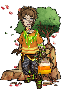
Proportion-wise your work is really strong and very close Res Style. If I were to nit-pick it'd be to suggest being careful with major body parts like Ahea's feet, might do better for them to be ever so slightly more thick. When it comes to OAKs though, there is a little leeway considering this could simply be an Ahea with thinner feet. :3

I did some quick shading adjustments just to give you examples of what I'm talking about:

(Hi hello I streeeeetched the page!! Huzzah ovo)

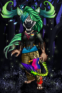
Last, for your item: Yes we absolutely use a blacked-out silhouette/lines for those thinner areas if it creates a better look than an ultra thin filled-out area. Depends on the look you're going for. Additionally, I might use a dark color instead of black just to help imply the color it should be. So for example, a super dark green for that flower stem.

Wow that turned out a lot longer than I intended, sorry!! I hope this helps! Feel free to use this thread to continue talking about this. :3c


doggydoe2000

5:47pm Oct 21 2021

Normal User


Posts: 1
we are not getting the email to verify the email
crowflux

12:43am Oct 23 2021

Administrator


Posts: 329
@doggydoe2000: Uh oh, I'm sorry to hear that! I would suggest sending in a tle="" target="">support ticket so they can help you. :)


GewelWulfe

9:01am May 29 2022 (last edited on 10:19pm May 29 2022)

Normal User


Posts: 157
@crowflux

Hi I'm curious if you could critique my WIP of my OAK custom I'm working on for my Achro Zenrix Stitchez


I know I'm not exactly perfect with the rescreatu style quite yet but I'm hoping I'm close to it (the reason for the different colors is so i could follow through on where everything is on the limbs and tail hope its not too confusing)


-GewelWulfe


crowflux

4:29pm May 30 2022

Administrator


Posts: 329
@GewelWulfe

Heya! Happy to help and take a look.

Overall--very nice sketch! 
I love the energy and playfulness of the pose! If you were to submit this into the OAK Queue, it would be accepted and we'd start the process of making sure it's closer to style. So please feel free to do so. :3

Would you be okay with my critique being posted here? If not, I'm happy to Rmail or DM.


GewelWulfe

5:39pm May 30 2022 (last edited on 5:40pm May 30 2022)

Normal User


Posts: 157
I'm so happy to hear that. I've been tweaking it off and on flipping the image to make sure everything looks good either way its facing.

I would love to have you critique my art and please by all means post it here. If it can help others with their art I'd rather it would be viewable by others.

-GewelWulfe


crowflux

7:25pm Jun 1 2022 (last edited on 7:27pm Jun 1 2022)

Administrator


Posts: 329
All the things I bring up here, we will address in the OAK process. 
That said I'm happy to share here for anyone's art journey as requested!

(In advance: If I point out something that's supposed to be different from a typical Zenirix, please disregard those comments.)

You've drawn in Res style very well so far!!
I think what would help you most, at this stage of the sketch, is to focus on overall depth, and the body parts' positions on the canvas (aka composition). Most of this is very well established already, which is a great jumping off point to refine further.

The only (small) thing that really stands out to me: The nose angle could be adjusted. 
The head's angle is very nice and clear. Notice how the head angle is overall downward-facing. Yet the nose appears a little more forward-facing. I think this could be easily adjusted by showing more of the top of the nose, rather than seeing the front of it. 
This really just depends on how you want it to appear, of course! If the intent is to have the head appear more forward-facing, other slight adjustments might be made instead.

Other than that, I would suggest exploring the overall depth of the pose as mentioned before. 
This angle is a challenging one, so I commend you for establishing a really strong sense of depth already in this sketch! I think to push it even more, explore changing the size of the body parts that are furthest behind to really push that point-of-view (mainly those back legs). Showing a flow between body parts can also help really push the depth (especially when it comes to the final line art). Such as the connection of the side-belly and the back leg/rump.

A great technique that will take anyone very far is that you can use shading to help explain these things more effectively than in the line art itself. This is one of the goals in Rescreatu Style; Reduce the details shown with line art as much as possible, and use shading to express those details instead. In doing so, you're often focusing more on depth than relying on lines to define these details, which can start to cause the art appear flat if overdone.

This response got longer than expected! It's much harder to describe than it is to show.

I hope this helped regardless! <3


GewelWulfe

3:44pm Feb 18 2024 (last edited on 3:44pm Feb 18 2024)

Normal User


Posts: 157
I almost forgot this forum existed. I need help with an OOAK I'm working on.

Here is the base color and looks 2000x2000 for detail

https://i.imgur.com/iPsbjPI.png

and then a smaller 200x200 one

https://i.imgur.com/fpdbZVq.png

any feedback would be loved

-GewelWulfe


crowflux

6:04pm Feb 19 2024

Administrator


Posts: 329
This looks so cool!! 

The sketch would be accepted for the initial OAK submission, and any further feedback I'd prefer to give through the OAK process so we can dive in. :3

For some quick feedback from off the top of my head, I think you could consider the head shape being wider akin to the original design, and the eyes a bit bigger, depending on any deviations that are desired. 

While I love how the back leg looks, I'm also finding it a little challenging to pinpoint how the back legs are supposed to be positioned.

Also potentially explore pushing the depth in the overlapping elements of the pose to make it look even more dynamic. Perhaps the flap of the ear that's farthest from us could be flowing behind the tail ever so slightly (to further emphasize that the tail is coming toward us). ♥


Go to page: 1