Achromatic Ardur


Go to page: 1 Bookmark Thread
Thowra

8:48am Aug 14 2013

Normal User


Posts: 749
Sorry if this is in the wrong category...I don't know if I should put it under here, support or bugs&glitches.

Anyway, I noticed the achro ardur looks...stretched. It's hard to describe bu the back flippers look much further away on the front flippers than on the normal ones, and the tail is much closer to the chin as opposed to the usual ardur. Is it possible to get the achro ardur to look the same (proportion wise) as the normal ardurs?


Everly

11:11am Aug 14 2013

Normal User


Posts: 1,274
Here's the difference. ^^

Mainly the back flipper thing and the tail. ^u^ even the shards are a bit off.
I like the ardurs as they are, but it'd be nice if they were all the same.


Dustfeather

12:18pm Aug 14 2013

Normal User


Posts: 4,093
Huh, I never noticed that. Why ARE they different? o-o Support to have them all the same.


Dustfeather -> Sparrow -> Universe
Thowra

4:57pm Aug 14 2013

Normal User


Posts: 749
Thanks for doing that, Flo! Makes it much easier to see the difference ^^


xeeroh

7:21pm Aug 14 2013

In Training


Posts: 355
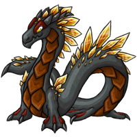
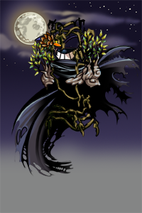
All graphics will be consistent, but they will be updated to look like the Achromatic graphic. This is actually the case with many Creatu graphics. The reason for these updated graphics is that some Creatu are missing graphic files, or color files and/or are illustrated at very low resolution. We cannot update these graphics for new Colors or Effects without updating and often recreating, the Creatu's graphic file.
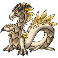
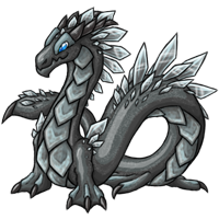
When rebuilding a graphic artist make subtle improvements such as increased shade depth and detail correction. For the Ardur, the choice was made to modify the body silhouette to  closer resemble an infinity symbol ∞

Although we have used the updated file to build the Achromatic graphic, the Ardur update is not considered complete. I would be happy to consider input from players for the updated version!
 One element I am particualry interested in feedback on is the update of scale detailing. The original Ardur graphic uses a texture la
yer, which is not consistent with our style standards, so the look has to be updated a bit.
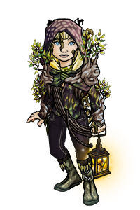
Here is a comparison between the old and updated graphics:

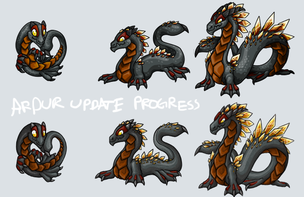
You can see this is a work in progress because there is a little area of pixels along the adult's left side to be erased still ;}
Personally, I am only really satisfied with the scale detailing on the baby graphic so far. The denser scale detailing is most like the texture of the original.


Kinera

8:19pm Aug 14 2013 (last edited on 8:19pm Aug 14 2013)

Normal User


Posts: 640
I actually love the update, and prefer that over the old one! The shards look awesome without the texture. And I love the new scales the ardurs have recieved. :3


.
Thowra

6:19am Aug 15 2013

Normal User


Posts: 749
Nice! Didn't realise that was the updated ardur.

I actually quite like the detail of the scales on all stages for the updated version. One thing I'd like to ask for, if it's not too much, is if you could make the head on the 'new' adult a little bit bigger? The 'old' ardur looks more majestic because its head is 'held high'. :3

But I'll still love ardurs either way!


Dustfeather

11:37am Aug 15 2013 (last edited on 11:40am Aug 15 2013)

Normal User


Posts: 4,093
The head on the new one is actually bigger than on the old one. ouo

Looks good so far Xee! I can agree that the baby's is the only one that looks truly complete though. I think on the teen especially, the lighting of the scales looks kind of random and too spread out across the body. It doesn't look like it has a consistent light source when it comes to highlights. On the baby (and this was probably easier since its body is smaller) the shading and highlights look like they're connected very smoothly; they don't start or end very suddenly, and it makes it look connected and gradient-like by integrating small specks of dark into the light and vice versa. If the other two stages could have smoother transitioning between shading and highlights as the baby does it would look awesome c:

Loving the new attention to depth though-- the new Ardur definitely "pops". Darker darks and brighter brights, especially on the shards/gems on its back. Can't wait to see progress. ~


Dustfeather -> Sparrow -> Universe
Go to page: 1